Our Universe in Color
Today we released six new images from Chandra’s vast data archive. Each one of these astronomical images combines X-rays from Chandra with data from telescopes that detect different types of light such as infrared, radio, and visible light.
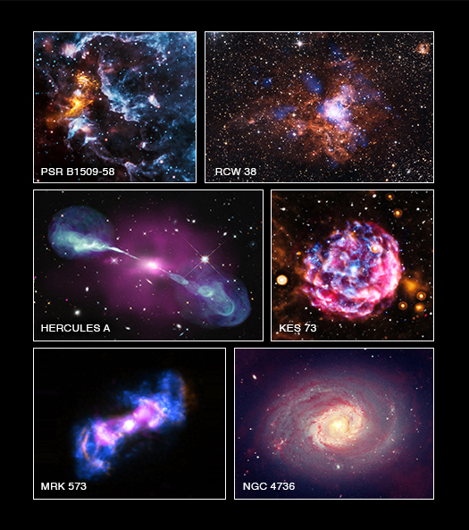
You may notice that the color maps in this new collection of images are not the same. For example, in the image of PSR B1509-58, X-rays from Chandra are colored blue, while in NGC 4736 the X-rays are gold.
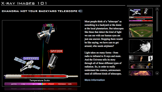
Why is this? The answer is that each astronomical image produced serves multiple purposes. The first goal -- and most important – is to accurately represent the data observed by each telescope, showing the key scientific features in the image. (For background information on how Chandra data are sent from the telescope to the ground and then converted into images, look at “X-ray 101”)
Closely related to that is to make sure the image looks good. That probably sounds rather subjective (“beauty is in the eye of the beholder,” and all that). It can be, but there are well thought out rationales that go into each decision. For example, some colors when combined with others can make an image look muddy or blurry. Or, certain colors can create a garish or distracting effect when combined that essentially blocks part of the science story. So the careful use of color to tell the tale of the data, and paying attention to the aesthetics of the image created, go hand in hand.
There are some established image development conventions in astronomical images. Many astronomy image processors follow a chromatic ordering of color, where red is applied to the lowest energy, green to the medium, and blue to the highest energy data in the image. This generally makes sense when making images that contain visible light or infrared data.
However, the technique doesn’t always work out well when we make images that contain, say, X-ray data with infrared light. Or perhaps X-rays with radio. Or other combinations of light that vary widely across the electromagnetic spectrum.
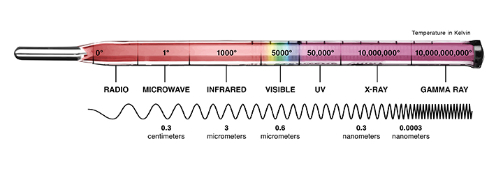
Most astronomical images contain light that is invisible to our human eyes. The data needs to be translated into a form that our brains can process. Adding color to the different data layers of the image provides more information for the viewer. So there is not necessarily a “right” sequence of color, nor is there a “wrong” one.
We like to look at each Chandra image, whether showing X-ray data alone or with other kinds of light, as an opportunity to tell the best science story possible for that object. Color is just one way to do that, and we are careful to clearly convey which layer has which color. We take it a step further on our web site and make sure you can click through each individual dataset and then look at all the layers combined in a composite image.
In fact, we care so much about how people perceive and respond to our images that we’ve put together a research group called “Aesthetics and Astronomy”. And we continue to investigate ways to make the best images possible – including how we use color – so that anyone can enjoy a window to our Universe.
-Kim Arcand, CXC
Please note this is a moderated blog. No pornography, spam, profanity or discriminatory remarks are allowed. No personal attacks are allowed. Users should stay on topic to keep it relevant for the readers.
Read the privacy statement